When it comes to giving your home’s interior a facelift, few design tricks are more versatile (and impactful) than two-tone painting. This trend is taking the UK by storm, and provides a fresh, modern way to add depth, character and personality to your room. From creating a bold statement, to a subtle, sophisticated vibe, two-tone painting is the answer. For those of you who might feel unsure of what colors work together or feel confused about the process of creating your next home masterpiece, we at Nevis Paints are here to provide all the guidance you could possibly need.
Two-Tone Painting: The UK Home Style You’ve Been Missing
Britain’s housing stock is so varied, from Victorian terraces to modern flats, that two-tone painting is a perfect option. It allows homeowners to draw attention to features that may be unique, such as a high ceiling, alcove or fireplace, and gives it a modern spin. Two-tone walls can also make smaller spaces appear larger, or lend a cosy atmosphere to bigger spaces. Keep in mind that a balanced color mix ultimately leads to a harmonious look, which will depend on your style.
The Best Two-Tone Paint Ideas for 2024
Two-tone paint ideas have been the must-have envy for UK homes in 2023 — here are the most sought-after color pairings that will work wonders for your space.
Flattering Earthy Neutrals with a Pop of Color
Beige, taupe and pale greys in earthy tones, for example, are classic color schemes for UK interiors. Balance these light neutral tones with a deep accent color, like forest green or terracotta, for a dramatic effect. The combination works wonders in living rooms and bedrooms, providing a soothing but bright atmosphere.
Monochromatic Elegance
Two shades of the same color can have a sleek, sophisticated look. In short, use a lighter blue with a darker navy tone. This monochromatic method adds depth and interest without making the area feel crowded. It’s a boon for modern kitchens or home offices.
Pastels with Bright White Accents
Pastel colors such as blush pink, mint green, and pale lavender are returning to UK homes. These colors create a fresh and welcoming effect when combined with clear white. It is perfect for bathrooms and kids’ rooms, delivering a playful but sophisticated feeling.
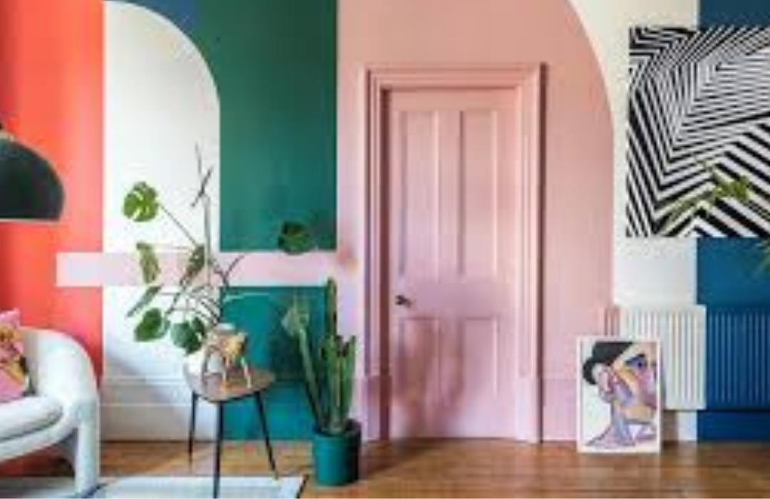
Bold and Dramatic Contrasts
If you want to go for something with a bit more attitude, mix in bold colors such as deep navy paired with rich mustard yellow or emerald green with burnt orange. These high-contrast pairings are ideal choices for feature walls or dining rooms, bringing a sense of drama and sophistication.
Natural Greens and Warm Woods
Bring the outdoors in with a mix of earthy greens and warm wood accents. This allows you to keep calm and organically look within your home. Paint the walls a soft sage green and complement with warm wooden furniture or accents for visual continuity.
Tips to Choose Your Kinda Two-Tone
Choosing the perfect two-tone paint pairing can seem daunting, but use these tips to figure out the right combination for your home:
- Think about the purpose of the room: Consider how you will use the space. For instance, soothing colors such as blues and greens are best in bedrooms, while lively hues suit communal spaces such as lounges.
- Always Paint it Out: Always test paint colors in situ before you commit. Lighting can have a huge impact on how colors look, which is why it’s important to look at them in different conditions.
- Find the Right Proportion: Your two-tone palette or spring hues must read as balanced. If one color is bold, then the other should be more subdued so that it doesn’t overpower the space.
- Emphasize Architectural Elements: Use two-tone painting to highlight elements such as alcoves, archways, or fireplaces. This technique brings character and helps the eye focus on rare elements in your home.
How to Professional-Grade Two-Tone Paint
Now that you’ve selected your shades, it’s time to realise your vision. Here’s a guide to achieving a foolproof two-tone finish, step by step:
- Wall Preparation: The first step is to wash and the walls and then start with the priming for a smooth and even finish.
- Mark the Break: Using a spirit level and painter’s tape, mark where the two colors will break. This will make a crisp and clean edge.
- Color #2 goes next, just above Color #1. This gives a feeling of openness and brightness.
- Apply the Darker Shade: After letting the lighter shade dry, apply the darker shade to the bottom of the wall. This helps to ground the space and add depth.
- Remove the Tape Gently: Carefully pull away painter’s tape before the paint dries too much to avoid tearing or uneven edges.
Reasons to Use Nevis Paints for Your Two-Tone Project
We know what it takes to transform your home from drab to fab. Knauf Plaster products come in a variety of shades and finishes to complement your two-tone work. Plus, they come with expert advice and luxurious products that are not only indulgent but also practical, so you can easily achieve and maintain a professional result.
The two-tone paint job is a go-to quick fix that adds personality and style to a UK home. From striking contrasts to understated harmonies, this trend opens the door to endless possibilities in crafting a space that reflects your identity. The right colors and techniques can turn any room into a modern classic.
Ready to get started? Check out the newest two-tone paint inspiration and dare to find your combination with Nevis Paints. Your dream interior is a brushstroke away!